Back in 2005, The Huffington Post launched its first commenting system, and until recently, little has changed in HuffPost's commenting interface -- or the technology behind it. For some, HuffPost has since become a place to engage in genuine discussion, and we wanted to capitalize on this by surpassing the limitations of the original commenting system. That's why earlier this year, on select sections, we launched Huffpost Conversations... which didn't exactly fulfill our expectations.. Our most frequent contributors weren't shy in telling us that the new format didn't work for them:

They wanted to know: why fix what wasn't broken?
We'd like to explain some of the reasoning behind the decisions to rebuild the commenting system, and to give a brief run-through of the newest addition to the platform: Conversation Carousels.
Problems with the old commenting system:
1) Some threads became too skinny.
Hardcore contributors will know exactly what we mean when we refer to a reply chain that had gone so far that it was almost paper thin. This is an actual screenshot:
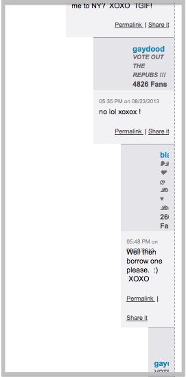
In fact, we learned that this happened often enough that some users actually had a nickname for when this happened: hitting the wall. Removing indentation solves this problem. We wanted to find a solution where all replies could appear full width, regardless of how long the thread was.
2) With longer threads, it was hard to know who replied to whom since the indents were hard to line up.
At times, you'd have to scroll up and down in order to follow the discussion.
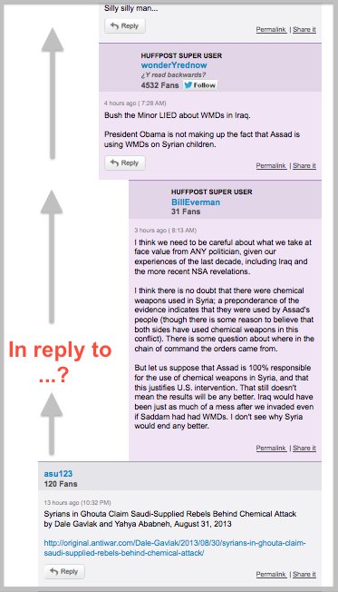
Some users went to great lengths to follow the discussion, including carefully scrolling so their mouses wouldn't move, cutting and pasting into a text editor, and even putting their finger on the screen to follow the thread upwards. This is a problem inherent to all threaded comment platforms, and we wanted to find a solution that would allow readers to follow the discussion without having to do any special scrolling or mouse tricks.
3) Threads were limited.
Even if we were to ignore the points above, there was still an inherent problem with indented threading: the conversation had to stop sometime. In the old system, once a thread got too skinny, the solution implemented on some threads was to take away the reply button, so no one could respond to the last reply.
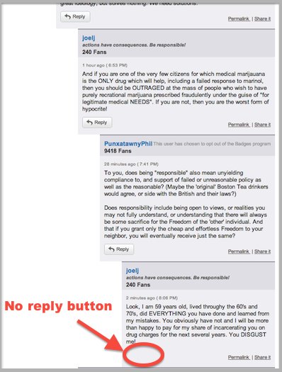
We wanted to create a system that allows the conversation to keep going... forever, if desired.
4) The design didn't work for mobile devices.
Trying to read an indented thread on a mobile screen was a difficult task. The threads would get too slim to read as discussions progressed and became more complex.
Here's an example:
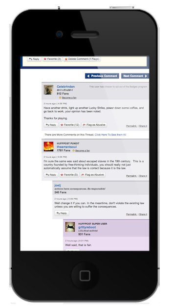
We wanted to design an interface for comment threading that would ultimately allow for full functionality on any device and treat mobile users like 'first-class citizens.' This means eliminating indentation. Mobile screens are much smaller, so indenting replies makes it difficult to read them.
5) Finally, the original commenting format was based on old technology, so fixing bugs or making any type of improvement was cumbersome and took a disproportionate amount of resources for even trivial work. We needed to start fresh using today's technology, instead of building on top of eight-year-old tech.
The Solution:
We launched the first iteration of Conversations to eliminate the problems with indented threading. There were lots of issues reported and plenty of complaints, which is expected for such a large-scale change. However, this version had deeper, fundamental issues. The number one problem reported was that following threads had become nearly impossible.
After brainstorming meetings, feedback fielding, design rehashes and even phone calls with contributors, we're moving towards what we feel is an innovative solution. We call them Conversation Carousels.
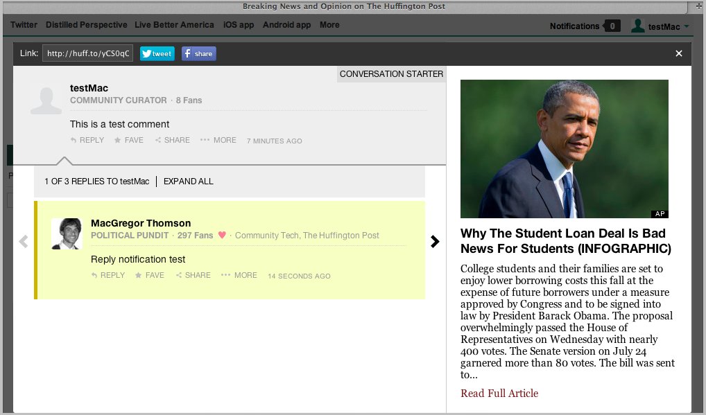
Here's how it works:
When reading a conversation in an overlay, full threads are shown all at once and you can click the left and right arrows to cycle through the different threads and replies:

If you prefer to see all direct replies to any given comment, click 'Expand All' to see them in a list:

We've also used the overlay implementation of the new format to improve notifications. Now, when someone replies to your comment, clicking on the notification (from any page on HuffPost) will open an overlay linking to the reply, making it easy to see the full genesis of the conversation, and allowing you to see a summary of the article where the conversation lives.

Challenges with the new format:
1) Bugs and kinks.
As with most new features on any site, there are bugs that we need to squash and tweaks that we need to make before everything works as intended. We have an excellent tech team working hard to smooth out the bumps in the road, but we encourage users to report any bugs or feature request to Support via the contact us page.
2) Overlays.
The above changes are currently reflected in Conversation overlays (when you click 'Read conversation'). We realize it doesn't make sense to hide replies in overlays. We're working to implement the changes on the article level.
3) Lack of discoverability.
We tried to solve a lot of inherent problems with threaded conversations in this design, and we realize that there's still work to be done to improve the Conversations experience on HuffPost. Our next focus is to reduce clicks. We want to make it easy for Conversations readers and contributors to find threads that are relevant to them, make sure they haven't missed any comments in a thread, and to allow them to easily invite others to join a thread... all with as little effort on the part of the user as possible.
4) Mobile launch.
Now that we've designed a platform that works and scales for mobile, we can begin implementing the design on out mobile platforms. Stay tuned!
Have an idea? Let us know below how the changes are working (or not working) for you, and how we can make your commenting experience at HuffPost better.
Here's a video we put together going over Conversations Carousels: