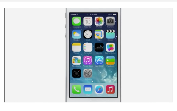
After Apple showed off its new design for the iPhone's operating system on Monday, tech writers and designers took to their keyboards to complain. Their problem with iOS 7 starts right at the surface: they don't like how the new app icons look. And now, we might have an explanation as to why.
The new icons are brightly colored and simple, a huge departure from Apple's old dark, detailed icons. They were mostly designed by Apple's marketing team, not by its designers, before being handed off to the design team for the final touches, The Next Web reports.
The lack of cohesion doesn't end there. "We’ve also been hearing that there wasn’t a whole lot of communication between the various teams behind say, Mail and Safari," The Next Web's Matthew Panzarino reports. "And that there were multiple teams inside each group that were competing with various designs, leading to what some see as inconsistencies in icon design."
Designers have been complaining about everything from the icons' colors to their inconsistency of design. Ben Moss of Webdesigner Depot found the icons' shapes to be troubling. "The singularly biggest issue — apart from the color — is that so many of the icons are clearly intended to be round, but are crammed inside rounded rectangles," writes Moss. "Apple set out with good intentions, but their fear of profit margins kept them from designing something truly exciting."
Designers aren't just expressing their dislike of the new icons, they're also taking matters into their own hands and designing their own. One Tumblr blog called "Designers Complaining" is collected laments about iOS 7 from Twitter. Another called "Jony Ive Redesigns Things" offers a tongue-in-cheek critic of Ive, Apple's design head, by redesigning other things in iOS 7's style. "Nothing shouts bad design more than design that shouts," Sasha Agapov, creator of "Jony Ive Redesigns Things," told the Huffington Post.

If Jony Ive designed a Coca-Cola can, it would look like this, according to @alecmcdowall.
Designer Sameer Ahmed also felt compelled to create his own versions of the icons because he found the new designs so aggravating. "I had to recreate them," Ahmed said. "I couldn't look at the icons apple created."
Not everyone dislikes the new icons, though. Anthony Wing Kosner at Forbes called the new icons "subtly dimensional and exquisitely modern."
Similar to how the uproar over design changes at Facebook eventually dies down and don't cause users to flee, Apple fanboys may get used to iOS 7 after it's release in the fall. Or Apple could heed the critics and change the operating system's look. Sources told The Next Web that the design is a "work in progress."
This post has been updated with a quote from Sasha Agapov and a photo from "Jony Ivy Redesigns Things."

