By Suzannah Weiss, Glamour
Sometimes the world of fashion has a bit of a crystal ball element to it--hello, we're all talking about spring 2016 now, before we've even started this fall! The color pros at Pantone traditionally reside as the seers who are providing our futuristic peek, releasing reports on what colors we'll be seeing a lot of in the future. They just wrapped up their research and have issued the official word on what's going to be hot for spring 2016.
"We saw a movement toward very calm shades contrasted with specific pops of bright primaries," Laurie Pressman, VP of Pantone's Color Institute, told us. "We [always] select ten colors because we feel that number allows us to express the full range and create a comprehensive color palette."
"We work with designers who will be exhibiting at New York Fashion Week in advance of the shows, beginning in early August. As we start to see the trends emerge, the team is able to differentiate tones and hues to find the exact shade that's popping up throughout many designers' collections," Pressman explained.
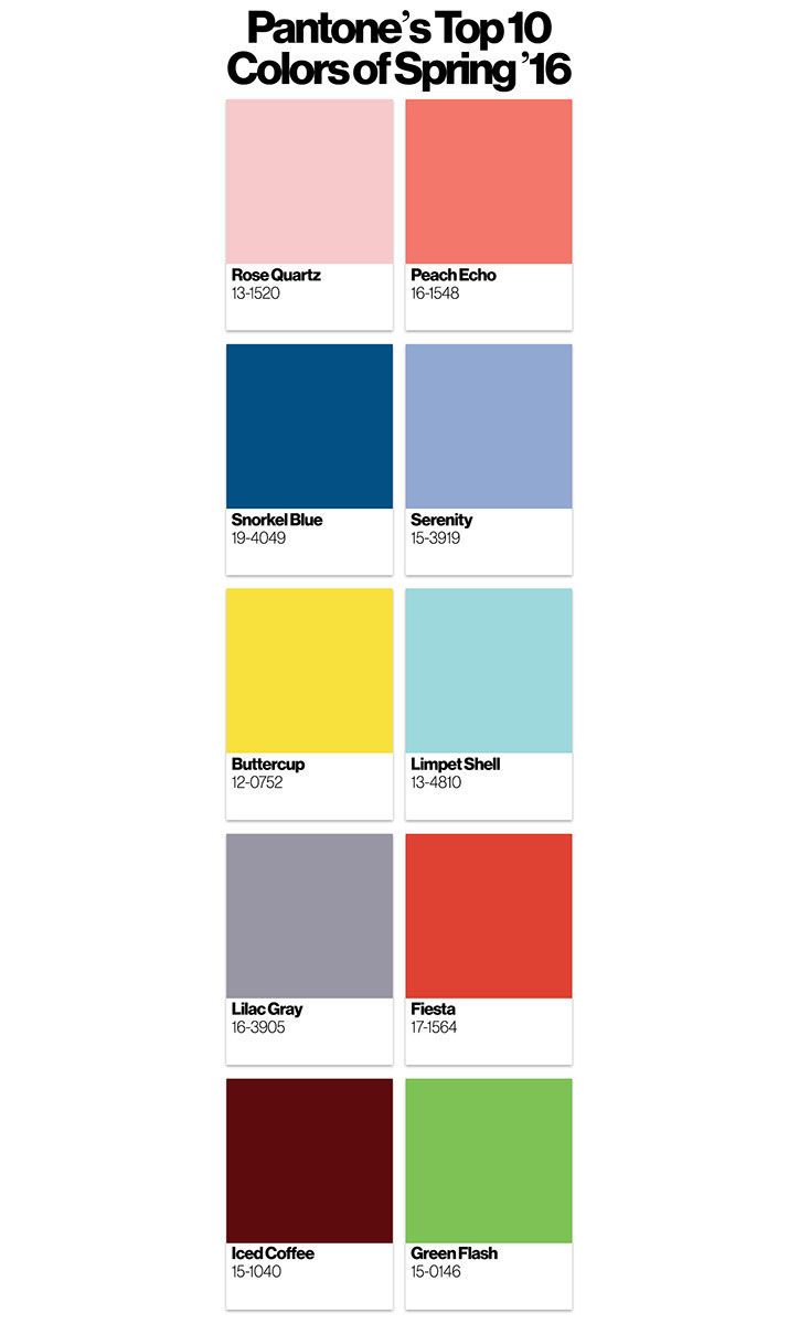
When checking out the swatches, know that all colors are not created equally. Rose Quartz is the number one shade, with 22.55 percent of designers using it in their spring '16 collections. Peach Echo, Serenity, Snorkel Blue, and Buttercup round out the rest of the top five. Per the experts, this means we're all searching for some peace.
"Serenity is a calming color that plays to the whole idea that we know we're still living in turbulent times," Pantone Color Institute executive director Leatrice Eiseman told WWD. "Buttercup is all about sunlight, happiness and cheer. This one just speaks to give us a ray of sunshine, something to be hopeful about."
Eiseman is a friend of Glamour--she spent time talking color with us earlier this year, revealing the best shades to wear if you want to make new friends, feel less stressed, or win an argument (though the same colors can mean different things for men and women).
The spring shades revealed today were gathered by examining designers' spring creations, but it's a bit more intense when Pantone selects its top hue of the year. It was a deep red Marsala for 2015, and we got the scoop on how that happened.
Image: Courtesy
More from Glamour:
10 Things He's Thinking When You're Naked
Fall 2015's Most Wearable Fashion Trends
56 Phenomenal Wedding Dresses That Will Make Your Heart Skip A Beat
What's That Salad the Kardashians Are Always Eating on Their Show?
6 Things Men Never Notice During Sex
Skin Care Products That Make a HUGE Difference in Your Skin, According to a Celebrity Makeup Artist