Kate Shepherd was born and raised in New York City. She received her MFA from the School of Visual Arts in 1990. She has been a resident at Skowhegan, the MacDowell Colony, and the Chinati Foundation in Marfa, Texas. Her work appears in numerous international public and private collections, and she is represented in New York by Galerie Lelong. Recent work is currently included in Coloring at Atlanta Contemporary Art Center [Jan 10-Mar 8, 2014]. The following is our exchange about her work, contemporary painting, and life in New York.
The full interview can be read on Standard Means
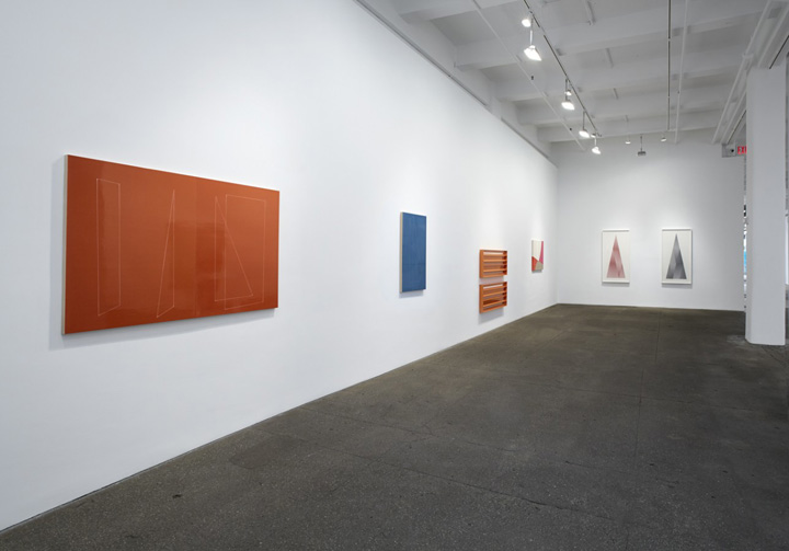
Installation View, Edge Order Rupture, 2013, Galerie Lelong
Ridley Howard: Since the show at Atlanta Contemporary Art Center is about color, maybe let's start there. It's interesting to think about how your focus on color shifts and changes, and has developed. In some ways, you have a pop sensibility. There is something very common and consumable about the colors you use, which seems deliberate. At the same time they can evoke space and light, time of day, or experience perhaps. Can you talk a bit about how you arrive at color in your paintings?
Kate Shepherd: Well said; I do like what we have come to consider "Pop" colors. An important shift took place when I started to make drawings on paint chips in the mid-90s. Each image was on its own miniature chromatic field, each one setting the tone, creating a reference that played off the image I drew. These tiny casual drawings were a huge shift for me after having made a living painting portraits. I was searching for a way to change my work and this was a liberating solution.
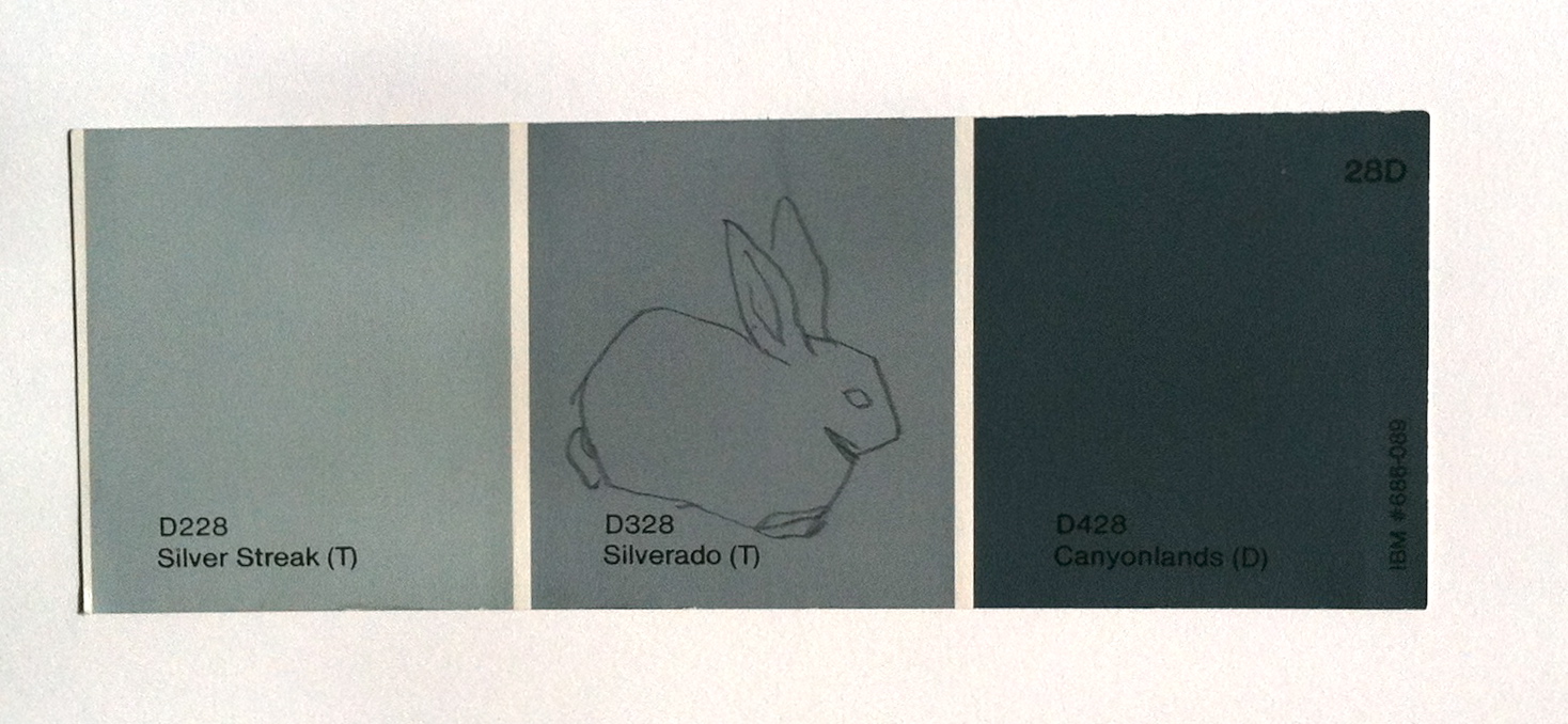
Lone Rabbit, 1995, 2x6 in, graphite on paint chip, courtesy of the artist
Often with color, I'm remembering a time when I grew up in the 60s and 70s--when cartoons, plastic, and graphic design were boldly chromatic. In art, I remember images by Sister Corita Kent, Calder and Lichtenstein, Robert Indiana, even Richard Linder. Color was something I really focused on, and sometimes I dressed in all red or all violet, head-to-toe. But depending on the painting, I'll either use something blatantly culturally referential, or a heavily-mixed less chromatic color to evoke a mood. I always "break" a color to set it apart from being too clean and "from the can"--better creating an atmosphere that also pushes it back spatially. Also, I am very interested in the relativity of colors, how they interact and how a palette is created, like in a yearly series of monotypes I do using the same image adjusted and flipped to create 200 different gradations of one hue. Often my interest in color is how it shows incremental emotional shifts.
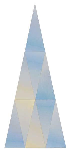
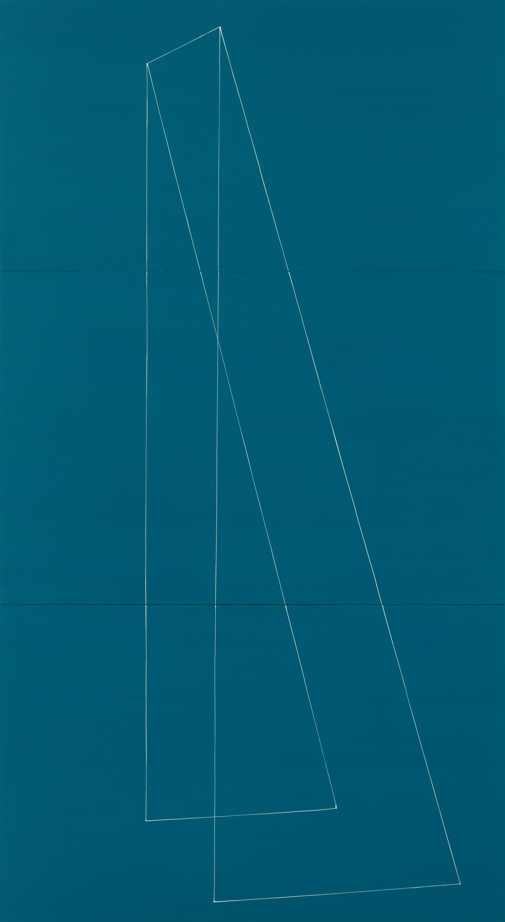
Triangle Study_02, 2013, cut screenprints, 51 x 21.5 in, courtesy of the artist and Galerie Lelong, New York
RH: Do you like a lot of art from the West Coast? And I know we have a shared admiration for Albers, though probably from very different angles.
KS: Speaking of subtle changes, when I first saw the nine-cell color triangle in Albers' Interaction of Color well, I thought I had hit a goldmine of possibilities. In the study, he shows how primaries make secondaries, what comprises tertiaries and the more you play with it, the more it unfolds. I took it upon myself to copy this work which is usually my way of understanding something better and making it my own. My triangles became more confined in hue and chroma yet they spanned in value, creating interlocking puzzles each with their own rhythm and logic. I also changed the proportion of the work to be very tall, as I tend to like to elongated forms, more like the size of a painting
In terms of the West Coast artists, that's an interesting question. If you have in mind otherworldliness, a remove from the "topics" of concept-driven art, then yes, absolutely. Like with McCracken, Larry Bell, Robert Irwin. I like very much how their work exists both as a discrete world while also reflecting its environs.
As well, I share with them an impulse towards what I might call a "soft absolute," meaning an experience that lasts longer than a passing expression; I'd say it's found in the realm of certain painters, like Morandi, and certainly Vermeer, and it's particularly important in portraiture.
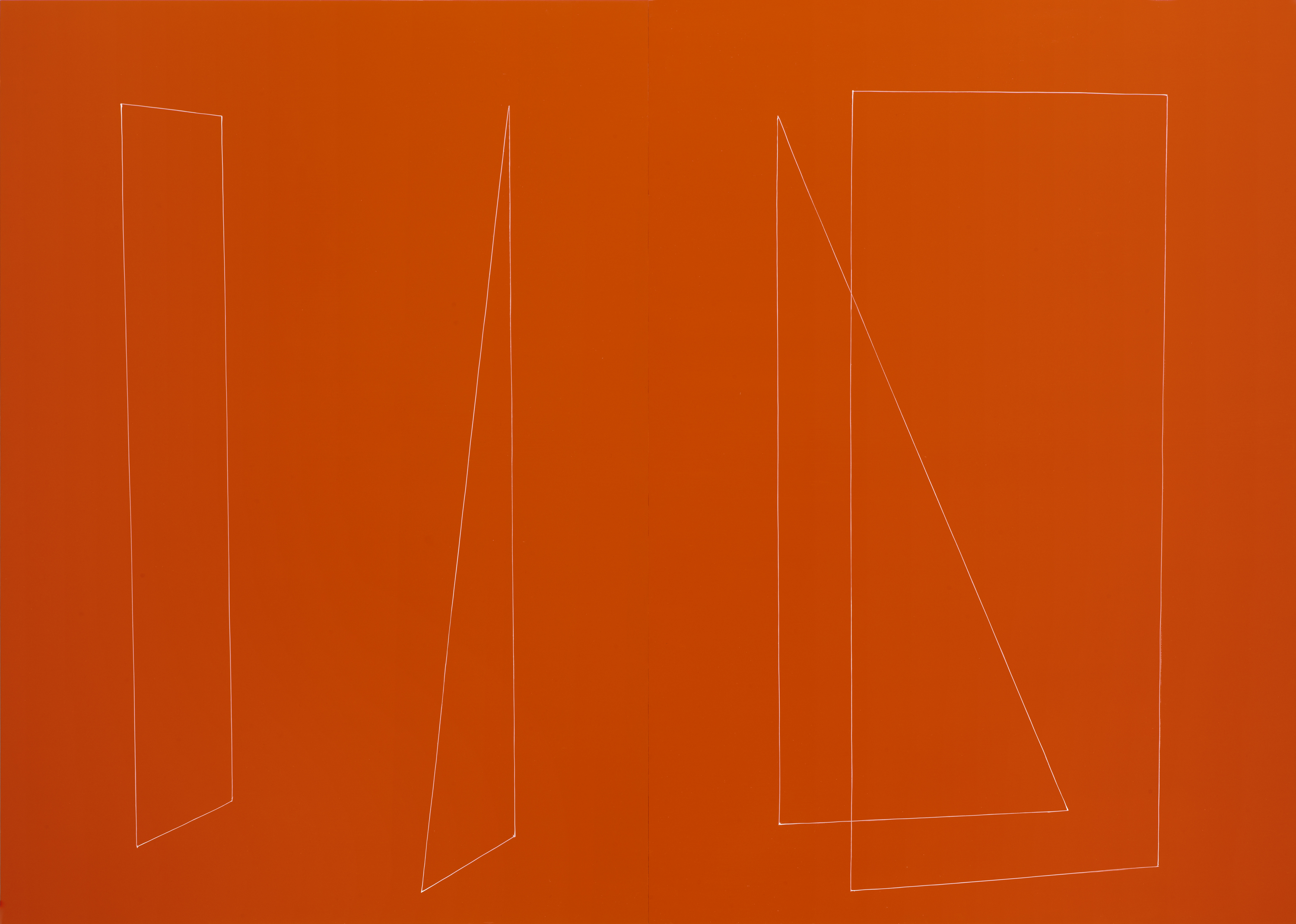
His Mistake, 2013, oil and enamel on panel, 40x50 in, courtesy of the artist and Galerie Lelong, New York
RH: It's interesting how the uniformity of your surfaces, the sheen of the enamel, the crispness of colors emphasize the flat surface, and your line-work and images play simple and elegant games with illusion and depth. You seem aware of the romance and impossibility of both.
KS: Interesting what you say about "impossibility," because once when I tried spraying the paint on the panels looked like kitchen cabinets; so I went back to painting them with a brush showing a subtle hint of the strokes that I had never noticed until they weren't there. Regarding the components--in truth, the wood panel is the wall, the all-over color is how one would paint architecture, and the line is diagrammatic of something in space. You could say that as a whole, I've side-stepped the traditional elements of painting by not using canvas, using only one color and avoiding rendering; it's basically an oversized drawing on a chromatic surface.
RH: And what about play, or games, or puzzles? Despite the minimal austerity, there is a more light-hearted spirit in the work.
KS: Games have always been fascinating to me. With my friends all over the world, I have games going through the mail and on the Internet. And to be specific about the work in this show, I could go on and on about the different kinds of puzzles that I've collected over the years. Basically, there are the ones that have been cut to follow the outlines of an image--like a Playskool wooden child's "tray" puzzle--and the ones whose pieces are independent of what is being depicted--like a 500-piece puzzle. I started to make my own puzzles with a jigsaw but came to a standstill regarding the subject matter. Then I wanted to make something as beautifully self-generated as the broken shell of a hard-boiled egg. I think the crack pieces work well because the cuts are the subject matter and the puzzle pieces all at once.
And I often come back to the basic perspective exercise--two sets of diagonal lines intersecting horizontal ones, and regular ticks off the bottom of the page. Each time I do it, it's different because I have to re-learn it.
Bellbottoms, 2013, 40x22 in, oil and enamel on panel, courtesy of the artist and Galerie Lelong, New York
RH: I know you grew up in New York. I have such romantic ideas about what the city must have been like then. And you've been working as an artist here since the early 90s. There seems to be so much recent conversation about how the city is changing, and its place in the new art landscape. Can you talk a bit about your experience here, either as an artist or a native New Yorker?
KS: Well, I felt good about using Central Park as a "subject" for the wood pieces; it felt like an homage. Regarding being a native New Yorker, I'm inherently non-rebellious. Once you've grown up with eccentric parents who have given you a long leash, where are you going to go? The aspect I love most about New Yorkers--at least the way I was raised and have tried to instill in my son--is an awareness of others; our building was like a commune and my mother was and is still making soup for someone. The flipside to this is that I am very aware of other peoples' opinions and they tend to matter too much to me. New York has changed, yes. It has fewer reminders of post-WWII commercial life: the smoking man billboard in Times Square, the narrow cheese shop run by Holocaust survivors, the original Henri Bendel, the New York accents. Wait...I almost forgot-the original MoMA and the gum machines on the subway platforms.
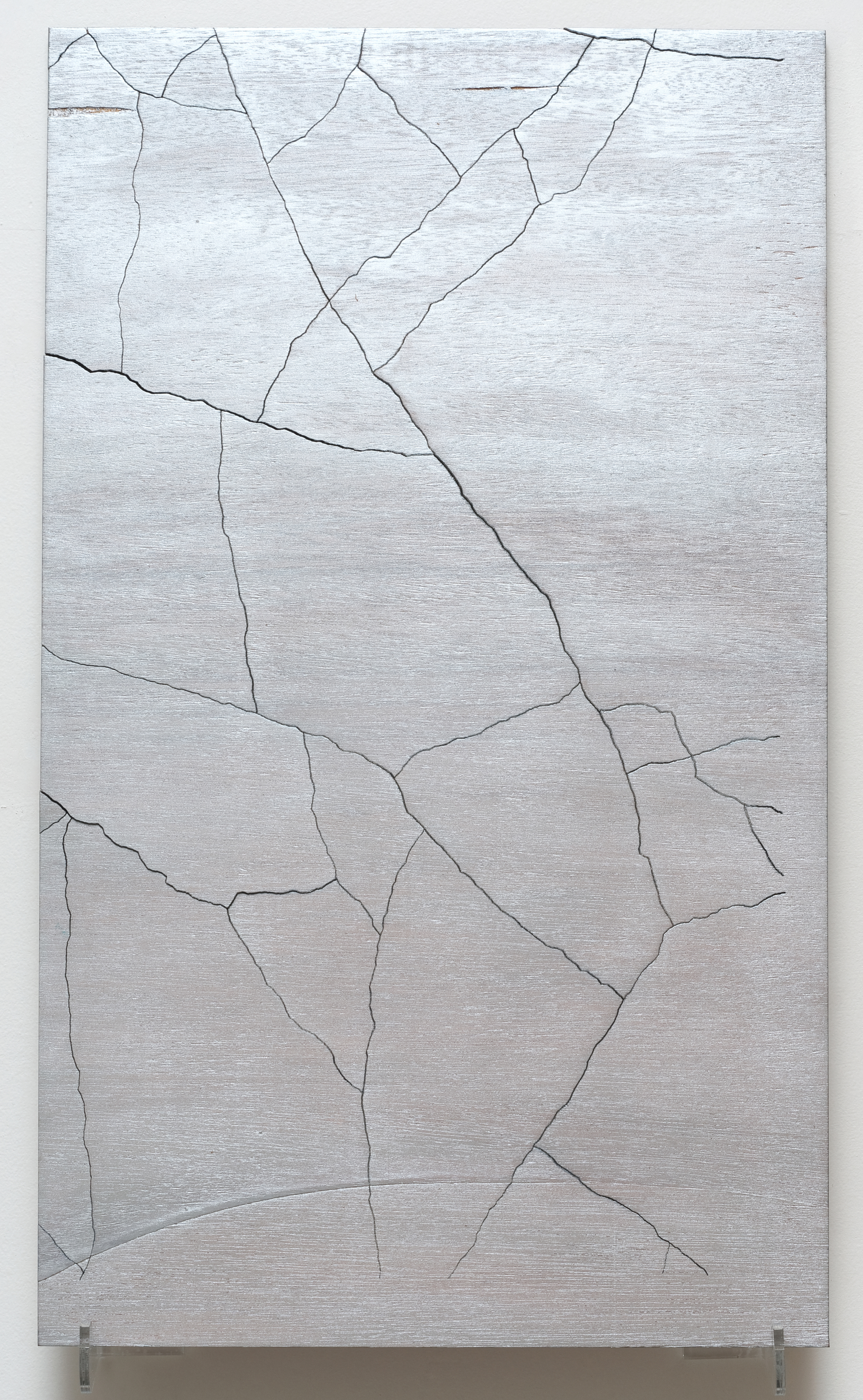
Tall Boy, Central Park, 2013, laser cut plywood, stained, 29.5 x 17.5 inches, courtesy the artist and Galerie Lelong, New York