
Painter John Zurier -- whose exhibition A spring a thousand years ago was recently on view at Peter Blum Gallery -- is attracted to the idea of spareness. One of his stated goals as a painter is to achieve "...the maximum sense of color, light, and space with the most simple and direct means."
Zurier's works coax viewers into a state of heightened awareness while offering few references: they are cleansing, enticing and poetic.
I recently interviewed John via e-mail and asked him about his background, his working methods and his ideas.
John Seed Interviews John Zurier
John Zurier
John, you were raised with fine modern paintings around you. Can you mention a few of the things that your parents collected and describe how their presence affected you growing up?
My parent's art collection had an immense influence on my life. That is how I first learned about abstraction and color and surface -- all things I am concerned with in my own work now. I was very lucky to have been able to live with them when I was young. There were paintings by Joan Miró, Robert Motherwell, William Baziotes, Antoni Tàpies, Alfred Leslie, Norman Bluhm, and Richard Diebenkorn. But at the core of it were paintings by the German Expressionists and some of the American abstract artists from Stieglitz's group.
The four that made the biggest impression on me were a large painting of a dancing girl by Ernst Ludwig Kirchner, a watercolor by Oskar Kokoschka, Marsden Hartley's painting called the The Warriors from 1913, and Arthur Dove's painting Moon. Dove often made his own paint and frames and for some reason this was very appealing to me, and I think that is where I got my interest in materials. I loved the thin, dry paint Dove used in Moon. There is a brushstroke at the bottom of the painting that is both odd and brilliant. I used to wonder why it was there and how he did it. I'm still thinking about it.
Diebenkorn was probably the one I looked at the most, though. We had paintings from his Urbana and Berkeley series, and what I love about Diebenkorn is that his method is always on the surface: you can really see it all right there.
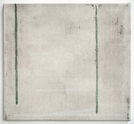
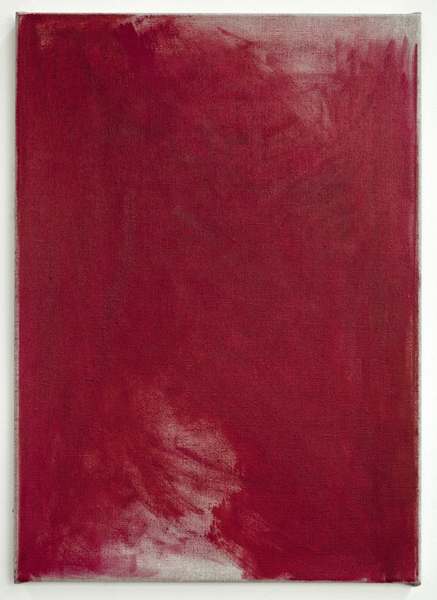
Filadelfia, 2012
distemper on linen
21 x 23 in. (53.3 x 58.4 cm)
Courtesy of the artist and Peter Blum Gallery, New York
You had some important mentors -- I know Elmer Bischoff was one -- can you mention some of your teachers and talk about their importance?
I went to UC Berkeley and I studied with Joan Brown, Sidney Gordon, Robert Hartman, Jim Melchert, and Elmer Bischoff. Elmer was the most influential in terms of painting, and he taught me a lot about color, surface modulation, and the importance of mood. He had a great way of talking about feeling, intuition, and poetics, and that how a painting is made is also its content. He talked a lot about the "information" in Toulouse-Lautrec's and Edvard Munch's paintings; and the color harmonies of Titian's late works.
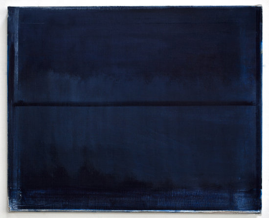
After Paolo Schiavo, 2013
oil on linen
17 x 21 in. (43.2 x 53.3 cm)
Courtesy of the artist and Peter Blum Gallery, New York
Your paintings over the years have been sensitive to light, color and atmosphere: is it correct to say that you are now flirting with form?
I don't think so. Even when I put shapes or lines in a monochrome field, I am thinking of form in the largest sense -- as how something is made. Form, for me, means dealing with the total construction of a painting, not geometry or making a picture of something. I'm very interested in how compositional formats and motifs, and even incidents in a painting can trigger perceptual responses and associations. Even a horizontal line can be read as a landscape, but it's not my intention.
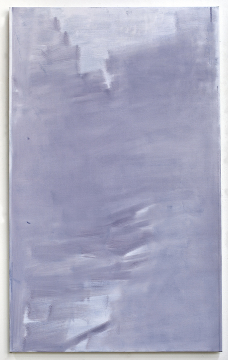
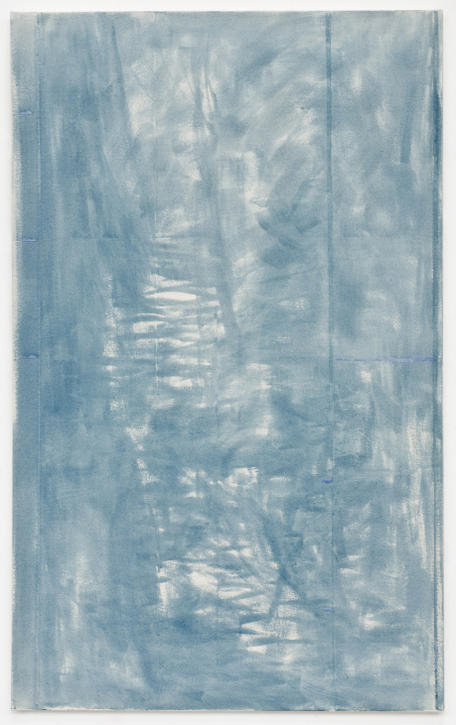
Öxnadalur, 2013
oil on linen
72 x 44 in. (182.9 x 111.8 cm)
Courtesy of the artist and Peter Blum Gallery, New York
Tell me about some of your experiments with media.
I often make my own paints and grounds and I'm always discovering new things. My interest in materials involves looking for the right color and how the surface affects the way light is reflected or absorbed. I use various types of raw cotton and linen canvas and pay close attention to the different colors and textures of the weave. I also sometimes use pre-primed linen. I will also grind my own oil colors and I make tempera paint by mixing pigments into animal glues. I do a lot of research and make tests. It's part craft, part chemistry, and part like cooking. But as a rule, I try to keep the materials in a painting simple.
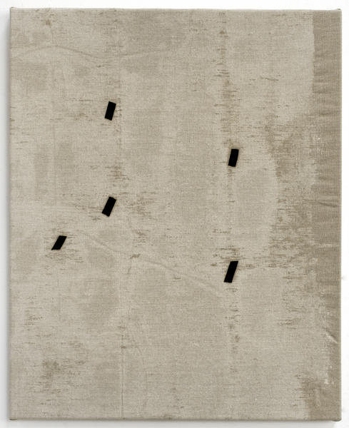
Sorgin, 2013
oil on linen
21 x 15 in. (53.3 x 38.1 cm)
Courtesy of the artist and Peter Blum Gallery, New York
How did you first travel to Iceland, and how have your travels there made an impact on your paintings?
Larry Rinder had been telling me about Iceland for several years, and in 2002 my wife and I went with him and a group of friends on a 6-day horse riding tour. I loved Iceland, but for some reason I didn't manage to come back again until 2011. I'm in Reykjavik as I am writing this (at the end of July) and I have been here since mid-May. The landscape and light have been a huge influence on my work. Also the people, the language, literature, music, poetry, and art have made a big impact. An Icelandic friend told me about a story by Guðbergur Bergsson, about a man who grew up at the foot of a mountain. He moved away and missed the mountain so much he had a painting made of it. He moved back to his old home at some point, and he would sit in his house with the shades drawn and look at the painting of the mountain. I love this story -- with its memory and longing it feels very Icelandic to me, and it reads almost like a chapter out of Kenko's Essays in Idleness.
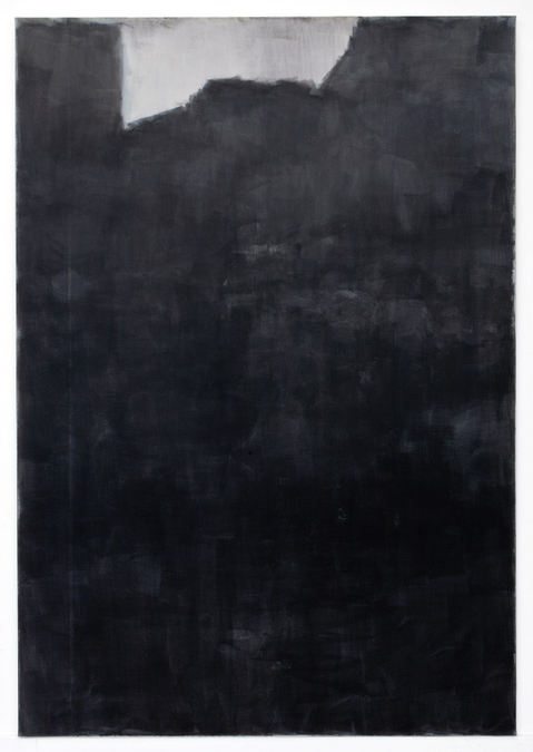
Svartur Klettur 2, 2012
glue tempera on linen
108 x 75 inches (274.3 x 190.5 cm)
Courtesy of the artist and Peter Blum Gallery, New York
Can you tell me about the poetry that inspired some of your recent work?
Bill Berkson and his poems are inspiring to me. They have lightness, depth, and grace. In 2011 we made a book together called Repeat After Me, published by Gallery Paule Anglim in San Francisco. Bill gave me the poems of an unpublished book to read and I made watercolors on Japanese notebook paper.
Lately, I've been reading Icelandic poets in translation, mostly the modernist poets Steinn Steinarr, Jón Úr Vör, Thorsteinn frá Hamri, and Ingibjörg Haraldsdóttir. I especially like Stefán Hördur Grimsson. I made two paintings with titles from Grimsson's poems. The title of my recent show at Peter Blum Gallery in New York, A spring a thousand years ago comes from a Stefán Hördur Grimsson poem.
A spring a thousand years ago, 2012
glue tempera on cotton
72 x 44 in. (182.9 x 111.8 cm)
Courtesy of the artist and Peter Blum Gallery, New York
How important has Japanese art been to your development?
It's been very important. I started reading about Japanese gardens when I was in high school and that lead me to study landscape architecture at Berkeley. But it took some time for me to realize that my interest in gardens was mostly metaphorical, and that the traditional Japanese aesthetic principals of simplicity, suggestion, incompleteness, and impoverishment, could be guiding principles for my painting.
One of my favorite Japanese terms is jinen or "naturalness." It means things as they really are, or from the beginning to be made so without any calculation, as in water runs downwards and fire goes upwards. It's not intellectual and can't be conceptualized. The paradox is that if one talks about it too much it then becomes calculated.
Around 1994, I became interested in the color grey and the Japanese concept of "killed colors." This involves the elimination of color by darkening it or thinning it down so that it hovers almost at the extreme limit of visibility. This is how I came to monochrome--not out of minimalism and post-painterly abstraction. I like the idea that in Japanese painting monochrome painting is the closest thing to emptiness.
Mosfellsbær, 2012
distemper and oil on linen
26 x 21 in. (66 x 53.3 cm)
Courtesy of the artist and Peter Blum Gallery, New York
Where do you see your work going?
I was traveling with some friends, and one of them was supposed to be in charge of getting us from point A to point B to point C etc. His intuition was good, and he was familiar with the place, but he was not good with directions, as it turned out. We would drive for a while, and then he would say, "Aha! So this is where we are." That is more or less how things go for me. Once I get there, I know where I am.
Note:
John Zurier's next exhibition will be at the Claes Nordenhake Gallery in Berlin opening on September 20