As more and more traffic comes to news sites sideways through shared links and search results, news organizations have begun reworking their article pages to act increasingly as the beginning of a reader's journey, and not the final destination.
Earlier this month the New York Times announced that it was redesigning its website, starting with the article page. In the same week, a news startup competing in the SXSW Interactive Accelerator, announced to the audience that "the article page is the new homepage." Both these incidents illustrate how news organisations are rethinking the reader journey in light of an established trend: visitors are increasingly arriving at websites via links directly to articles, and bypassing the traditional entry point of the homepage. Publishers who recognized this phenomenon early and designed their sites accordingly, like Mail Online, have seen enormous success in growing traffic. And now, some news sites are taking that approach further, such as Mashable, which has added a social element to guide readers deeper into its site.
The Grey Lady's New Style
In the prototype shared by NYT's marketing team two weeks ago, an animated preview shows a minimalist new article page design, as it will appear both on desktops and tablets (different designs for different devices is important!). For anyone accustomed to reading the Times online, perhaps the most obvious change to the article page is the new freedom from those pesky forced page breaks. In an interview with The Verge reporter Tim Carmody, NYT's VP of Search Products Rob Larson explained: "We've found that the levels of engagement in terms of time spent and depth of reading increase when it's on a single page".
You Might Also Like: Over $100 Million in Funding
Earlier this month at the SXSW Interactive Accelerator in Austin, Texas, a new player in the content recommendation space competed for the News Technologies prize. Contextly is a San Francisco based startup founded by veteran Wired editor Ryan Singel (@rsingel), that plugs into a publishers' CMS to intelligently generate recommended links that relate to each individual story (sounds like what NYT is doing, right?). I sat down with Ryan after his pitch to learn more about how it works.
One thing that Contextly does differently from other recommendation solutions like Taboola and Outbrain(which Worldcrunch uses), is allowing for greater editorial control over the related stories, Ryan explained. This is accomplished by actually integrating the Contextly technology into a journalist's workflow within the CMS, so that related links can be chosen by the journalist while they are writing a story. For example, Contextly can monitor all the links that have been embedded in a story, and use those as the basis to fill the "read more" box that appears under that article. The idea being that this allows news organizations to show off their expertise, and provides readers with a clearer way to dive deeper into a topic starting from the article page. Ryan also clarified that while Taboola and Outbrain offer publishers a way to generate extra revenue by displaying promoted external links within their related stories widgets, Contextly is all about keeping readers on your site and "turning drive-by visitors into loyal readers".
What's particularly illuminating about the content engine opportunity is the amount of money being invested in the space. The CrunchBase pages for Outbrain and Taboola show a total of over $100 million raised between the two startups in the past five years. Internally developing the technology and algorithms to produce highly relevant links is something most publishers will probably not invest in, and so there is clearly considerable potential for these third party solutions that plug into publishers' sites to do the job for them. One news site that has, however, worked closely with a design team to develop their own highly successful method for luring in fly-by readers is the UK's clickbait king, Mail Online.
The Science Behind The Sidebar of Shame
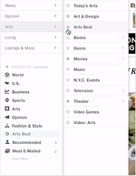
Mail Online, website of the British tabloid The Daily Mail, overtook The New York Times in March last year as the most popular English language online newspaper in the world. In August of last year, Mail Online broke the 100m unique browsers a month barrier. In January this year, Mail Online averaged just under 8m unique browsers each day... that's 38% higher than one year ago. Of all that traffic, "more than half of the Mail's page views come not from the homepage, but from click-throughs elsewhere on the site." And this ratio not unusual, compared to other news organizations. "Sixty percent of our audience is not coming through the homepage, so already the majority is not experiencing the homepage," Raju Narisetti, who was with Wall Street Journal at the time, told Adrienne LaFrance at Nieman late last year. At Worldcrunch, only about 10% of visits begin with our homepage, and it only accounts for around 12% of our page views.
"Mail Online breaks just about every web design rule in the book," - Jakob Nielsen, Usability Expert
In an interview last month with Brand42, the design team behind Mail Online, Kelsey Campbell-Dollaghan at Co.Design highlighted some important elements to the mid-range paper's success online. The redesign already dates back to 2008, but due to an early understanding of reader flow, Brand42 and Mail Online have managed to establish a site design and user experience that is still ahead of the curve five years later.
Perhaps unsurprisingly, much thought and effort was put into developing the Mail's infamous sidebar, which has an average of nearly 70 stories and accompanying thumbnails on any given article page, Campbell-Dollaghan revealed. As the Brand42 team described it, "we created a radically different information architecture, allowing more flexible entry points and journeys through the site"; one manifestation of this is the sidebar, which Campbell-Dollaghan calls an anchor that pulls readers into the next story. By packing such an enormous amount of suggestive photos and enticing titles onto an article page, editors are able to propose a multitude of content journeys to readers, preventing dead-ends (and earning Mail Online record-breaking traffic numbers). Other more recent redesigns from news sites have taken this approach even further, including Mashable's addition of social sorting to story recommendations on article pages.
Bringing a social homepage to every article
When tech blog Mashable released its redesign on Dec. 4, 2012, much of the coverage focused on the new responsive design, but what really caught my eye was the new article page. In a post from Mashable's founder, Pete Cashmore, the three keywords he uses to describe the new design are: social, mobile, visual. He goes into detail on some of the thinking and new features associated with each of those three tenants, but for the sake of focus we will look solely at social.
Mashable's new homepage is divided into three columns (three on a desktop computer, two columns on a tablet, and one on a smartphone), that same design layout is also used for section pages. Here's where it gets interesting: instead of pulling some elements from traditional homepage design and working them into the article page, Mashable actually puts an entire section page under each article, with infinite scroll in all its visual glory.
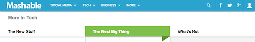
Furthermore, where most news organizations chose to display thematically related stories with their articles, Mashable takes this a step further by dividing story recommendations into columns according to their popularity and how much they've been shared to social networks. Cashmore explains: "Stories begin in a column called "The New Stuff". If they are about to break out on the social web, they progress to the middle column, "The Next Big Thing". Those stories with the most social engagement move to "What's Hot"." (Interestingly, when the site is viewed from a tablet, the two columns show the titles of "New" and "Rising", the latter seemingly a combination of both "The Next Big Thing" and "What's Hot". When viewed from a smartphone, the single column is just called "New".)
Not only does this strategy provide readers a virtually endless amount of ways to continue their journey from any article within Mashable, it also allows for Mashable to keep displaying an unlimited number of ads as readers continue to scroll further and further into the section archives. We've yet to see any figures on how this has increased readers' time spent and page views per visit, but Mashable's redesigned article page provides another intriguing example of news sites adjusting to address the importance of sideways traffic to their sites.
Two ways forward
The role of the news site's homepage as the digital equivalent of a newspaper's front page, that is to say being the definitive entry-point and guide to fresh, important content, is loosing relevance. Search and social referrals have fundamentally changed the way readers find content, and many website visits are now beginning at an article page and branching out from there. Many elements of The New York Times website redesign indicate an appreciation of this shift in reader habits, and the fact that the redesign has begun with the article page in itself might be the ultimate indicator. The millions of dollars being poured into startups that help publishers better entice readers to consume more of their content with related links widgets on article pages is also a strong indication of the potential value in harnessing this shift. And we can see from Mail Online's outstanding traffic figures the very real value in treating article pages more like homepages by using them to showcase a multitude of stories to prevent dead-ends. Mashable's approach may indicate the near future of article page design, with the incorporation of social sorting to article recommendations and full section pages underneath all stories.
The editorial significance in laying out a homepage or section front has not changed, but as the individual story page continues to evolve into being both a gateway and a destination, we can see from the above examples two different ways news organisations are responding to the opportunity. For the moment, sites seem to be choosing between more editorial decision making on article pages or data-driven automation of story recommendations. Very soon we will likely see more publishers embrace a combination of the two, with the best performing stories getting extra editorial attention for article recommendations while the rest of the stories get the algorithmic treatment.