Katherine Bradford is a painter who lives and works in Brooklyn, New York. She is represented by the Edward Thorp Gallery.
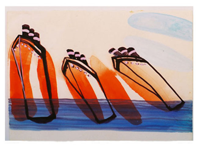
Katherine Bradford: Toppling Liners (2007) Gouache on Paper, 11x 14 inches Courtesy of the artist and Edward Thorp Gallery
Katherine, I loved that interview you did with Jason Stopa at Brooklyn Rail. You said, "It was the huge ocean liner being completely humbled by the ice in the sea. That story's very close to 9/11, our World Trade Center towers which collapsed before our very eyes, something we never thought would happen." It seemed like a kind of existential mood took hold (at least that's the phrase that occurs to me) and came through your paintings in the form of Titanic and Superman being toppled or humbled. Was this idea something you were consciously aware of while you were painting or does it occur afterwards?
The toppling liners were done before 9/11, before the banks collapsed. I think I wanted to subvert the insistent verticality of a looming ship by tipping it sideways.
The result was a sort of dismantling of the usual strength symbol of a big sea going ship. The Titanic kept appearing in my work because of the visual interest between the black ocean liner and the white iceberg, between rectangle and triangle, between man made and organic. Once I heard the painter Suzan Frecon say "all my decisions are visual." She's an abstract painter and I knew just what she meant.
It took me awhile to learn not to put too much story into the Superman and Ocean Liner pieces. I pretty much focused on the sight of Superman flying and the sight of the ocean liner in the same frame as an iceberg. You see how much I left out, great chunks of both of these legends. Anything more seemed like it would be too much information and in the end I had to consider what worked best to present clearly in a single frame painting.
On the other hand, I really like having both balls in the air: the tension between formal elements and also the stories. The tone I'm most drawn to is one of vulnerability and searching which seems to also reflect the way I paint, my touch, and also the way I proceed through a painting which is to try and find the forms in the process of putting the paint on. However, once a painting is finished it's always very interesting to reflect on how it communicates to the viewer, the various interpretations, and I thank you for this chance to revisit these works in this way.
So clearly I attributed something of mine to the paintings, interpreting them according to my existential mood linked to 9/11!
Katherine Bradford: S.O.S. (2012) Oil on canvas, 61x69 inches, courtesy of the artist and Edward Thorp Gallery
Can you say something about color in your work. I am really struck by the colors, the orange and pink, for instance, in S.O.S. and Midsummer Night, are so spectacular. Is this conscious and deliberate or is it a more intuitive process?
Thanks for noticing the orange and pink. That came at a moment of heightened confidence when I felt I'd done enough paintings for my upcoming show and could fly around the studio doing whatever I wanted. I think artists have to USE color and think in terms of putting color next to color rather than of describing something. If you squeeze out tubes of the most vibrant 6 basic colors plus black and white and then as the studio gets heated up and brushes get loaded with paint and you're working so fast that bits of one color get into another color, well hopefully fabulous things happen.
My mother was a very visual person and often talked to her four kids about what she was looking at and asked our opinions. She was the daughter of an architect and her son, my brother, is an architect. Even now I can picture her at the kitchen sink with all sorts of Matisse postcards and art clippings pinned up on the wall for her to look at while she did the dishes. This I took for granted for many years until recently when I realized it was quite unusual.
The best times I had with my mother were when we went to a museum together to look at paintings. She was not at all supportive of me being an artist as she thought it would interfere with my wife and child rearing skills. Once I took her to see an absolutely beautiful exhibit of Morandi paintings at the Guggenheim Museum and after a few minutes she wheeled around and said to me in a very angry voice "Did this man ever have a wife and children?"
She loved going to my art openings and meeting my friends but was very skeptical about the artist bohemian life style even though the way she raised us was so eccentric some of my friends were afraid to have meals at our house. I guess the atmosphere was too rowdy and also she was what you might call a horrible housekeeper HOWEVER she filled our house with great color, always - flowers, peasant art (as she called it) and wonderful touches everywhere.
Katherine Bradford: Desire for Transport (2007) oil on canvas, 54 x 72 inches. Courtesy of the artist and Edward Thorp Gallery
Read the full interview with Katherine Bradford here.