

"You can turn the lights out. The paintings will carry their own fire," said American Abstract-Expressionist Clyfford Still about his super-sized, flame-streaked canvases. It's the artist's fiery palette that's the subject of a new show at Denver's Clyfford Still Museum: "Red/Yellow/Blue (and Black and White): Clyfford Still as Colorist" from January 25 to May 12, 2013.
Like much about this complex artist, the answers aren't black and white. Over 30 of Still's dramatic canvases are arranged in five sky-lit galleries, each devoted to one of his signature hues. Half the paintings have never been exhibited before -- part of a trove of some 800 works Still kept hidden for decades in a Maryland warehouse. The collection was finally revealed when the museum opened in 2011.
For Still, black was a warm, generative color, rather than a symbol of death, and he often used it in large expanses. Though the show steers away from further color symbolism, the takeaway is the overarching importance of Still's palette. "In all cases, Still was trying to create a single, powerful image," says Dean Sobel, exhibition curator and museum director, "and color more than anything else is the most powerful tool in his arsenal."
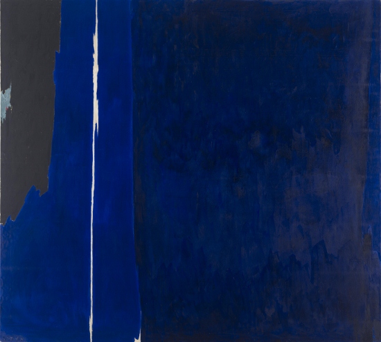 Clyfford Still, 1956 PH-223, Oil on canvas, photo: Gary Regester (c) Clyfford Still Estate
The exhibition was inspired by 1956 PH-223, a stunning deep blue painting bisected by a thin vertical line created by bare canvas. Still removed conventional titles from his works in favor of dates, letters and numbers. "As before, the pictures are to be without titles of any kind," Still instructed art dealer Betty Parsons in 1949. "I want no allusions to interfere with or assist the spectator."
According to Sobel, Still's unusual technique affects how viewers read his colors. In preparing his pigments, Still often added linseed oil which gave his colors a glossy appearance. Other times, Still applied drying paint to canvas, resulting in matte color. Within each primary color are variations. Still's blues range from turquoise and cobalt to inky midnight hues; reds from orange/red to the deep, earthy oxblood that's his hallmark.
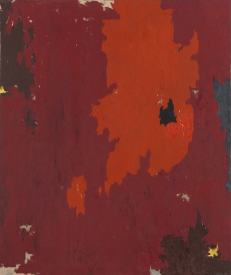
Clyfford Still, 1950 PH-272, Oil on canvas, photo: Ben Blackwell (c) Clyfford Still Estate
In the mid-1950s, Still began severing ties with commercial galleries and restricting how museums could lend and display his paintings. The artist also ended his friendships with fellow artists Mark Rothko, Jackson Pollock and Barnett Newman. In 1961, Still retreated physically, moving to Maryland, where he spent the last two decades of his life.
For Rothko, color expressed emotion, culminating with his last dark purplish murals for the Rothko Chapel at the Menil Collection in Houston. Unlike Rothko's palette which became increasingly dark toward the end of his life, Still's late works have a lighter, more ethereal feel with areas of raw, unprimed canvas along with white paint.
Perhaps the best clue to Still's use of color is found in his own words: "I never wanted color to be color," said the artist. "I never wanted texture to be texture, or images to become shapes. I wanted them all to fuse into a living spirit." For more information, visit https://www.clyffordstillmuseum.org/