If you haven't been held hostage in a wi-fi deprived hole this week, you've probably heard about the new University of California logo. In honor of Design Thursday, we decided to get some designers perspectives on the controversy. But first, a little background. Scroll down for a hilarious slideshow of reactions to the logo.
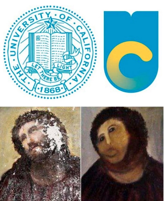
For the past 144 years, the University of California has stuck with a signature look, a seal with the simple motto, "Let there be light." But this year the prestigious public institution seemed to have an identity crisis and did what any self-conscious teen might do... got a total makeover. The updated seal wipes away the Victorian excess of the previous emblem, opting instead for beachy hues and trendy sleekness. But the minimalist attempt at contemporary style has infuriated many who didn't mind a university emblem with, you know, a classy sounding motto and an emphasis on books.
Designed by an in-house team, the new logo, which was quietly unveiled in November, is causing an uproar among students, faculty and people with eyes everywhere. While UC creative director Vanessa Correa said the updated design was meant to be "authentic, distinctive, memorable and thoughtful," its critics have compared it to a washing machine logo or a generic health care ad.
We think this meme pretty much sums up the popular opinion:

Perhaps even more revolting than the new logo itself is the bizarre video announcing it. Complete with bubble letters, hipster glasses and ambiguous soft rock it feels more like an outdated Internet provider appealing to "the youth" than an institution of higher learning. Check it out below:
The stripped-down design seems to attempt to embody the “California-ness” of the UC system in all the wrong ways. They literally tossed the book out of the logo. Is the sleek aqua design a desperate attempt to remain relevant and cool? If so, it's as if the UC logo got a bad Botox job. The sunny colors and simple shapes arguably reinforce the superficial notion of California as land of deep pools and shallow personalities.
Founding arts editor and California-based artist Kimberly Brooks, a UC Berkeley alumna, expressed her disappointment in the UC's new look in an e-mail to The Huffington Post:
I respect a hallowed institution's desire to update its brand identity. However, as a former protegé of Walter Landor, I feel that this one is profoundly off the mark. Never mind that it evokes nauseating images of a draining toilet, the gradation alone suggested it was designed by someone so ensconced in Photoshop that they gave no foresight to how awfully a blue-yellow gradation it will reproduce in print. The University of California should hear the deafening sounds of ridicule from the worldwide audience and make like Gap and New Coke before it by going back to the drawing board.
Matt Murray, Associate Creative Director at Huge Inc. in Los Angeles and an alumnus of UC Santa Barbara, also had a few remarks about the image:
The first time I saw it, my first reaction was to the gradient. In design training, you are told over and over again to avoid those kind of choices. You want to design a logo that can be reprinted in any medium -- a letterhead, an embroidered hat, or chiseled into stone. Your best chance of success will be something with a clear black-and-white design. It was surprising to see the logo incorporate the gradient, a design concept that is normally considered a big no-no.
Murray went on to say, "I don't think the new logo really pays enough attention to the university's tradition. In that sense it is not quite right."
Before you have a heart attack, find some comfort in the fact that the new logo is not meant to completely replace the old logo. Jason Simon, marketing communications director at UC's Office of the President, wrote: "The seal signifies the prestige and tradition of the university itself, and is a treasured part of the UC identity. There has never been any plan to replace it with the monogram." How exactly the old logo and new logo will be interacting was not explained.
See a roundup of logo bashing below and click here to see the petition against the modern UC look. What do you think, readers? Do you find the new design aesthetically appealing? Is it appropriate for an institution of higher learning? Let us know in the comments section. (For defenders of the logo, see The Atlantic's take here.)
UPDATE: Officials announced Friday that they would suspend further use of the logo and remove it wherever they could.

