Are "brand images" art? I do not mean to get all philosophical with you over this question. I just find that the new Twitter bird -- the one without the "t" -- has a real aesthetically pleasing feel. I have always liked Mazda's shapely "M." I think Apple's bitten apple icon is pretty appealing as well. I'm not above praising the more traditional symbols either, like the pirate 'skull and bones,' or updated versions like the skull tag by graffiti legend KATSU BTM.

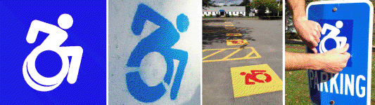
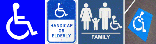
But some symbols do nothing for me, like freeway sign icons for "I-90" or the "pitched tent" camping icon. This doesn't get me peeved unless I think the symbol should do something. The handicap symbol falls into this "peeved" category because it represents not just a road or a location, but people. Yet the current handicap symbol, what turns out to be called the "International Symbol of Access," is not a symbol that represents people, or even "access," to my mind. The figure's arms and legs are drawn like mechanical parts, its posture is unnaturally erect, and its entire look is one that makes the chair, not the person, important and visible. Something is really wrong here.
Okay, let's get a just a little philosophical. Instead of thinking about the handicap image as a symbol, think of it as a brand icon. What might the handicap "brand" represent? What product might it sell? What are the associations and beliefs that this symbol conveys about people with disabilities?
For comparison, consider some vehicle brands: Volvo is associated with safety, Porsche with power, Honda with reliability; Harley-Davidson is leather-tough, skateboards are cool, bicycles are green. Now, consider the brand image of another vehicle of mobility, the wheelchair. What are some common associations and beliefs comprising the wheelchair brand equity and its related parking symbol? Helplessness? Quite literally "cap-in-hand" dependence? If these associations are at all plausible, it is time to rebrand the wheelchair image. My experience with people in chairs is different in the extreme: it's of people who are mobile, active, embodied, and frankly tough as nails.
Another clue that something is wrong is the very fact that we've come to call this symbol "the handicap symbol." What happened to "access"?
My point is, visual representation matters. As I was saying, by the sheer fact of their visual presence in our day-to-day lives, brand images necessarily function as a form of public art. And if Shephard Fairey and Banksy have taught us anything, it's that these images can also be a form of political and social advocacy.

When I consume images about objects, ideas, and other people, I can't help but generate unconscious attitudes about them, even attitudes as basic as "bad" or "good," "lame" or "cool." And I'm usually not at all inclined to reflect critically on my image-perceptions as they're being formed. This lack of critical reflection allows these images an immense power to shape my attitudes, either explicit or subtle.
It's decided then. The handicap symbol should actually look like a symbol of access: It should be forward, progressive, active, and embodied; engaged, ready-for-action, determined--conveying the sense of life and action that people with disabilities actually possess. What's more, it should live up to current artistic standards of public art. The symbol should even, perhaps, prompt reflection on our pre-reflective attitudes of people with disabilities. That's why we've developed a new "accessible icon," whose aesthetic features enhance the symbol for art and awareness.